An open source, two-way communication application for the social sector needed a brand identity. The end goal of the application is to empower communities. A large section of the vulnerable and marginalised communities remain impoverished due to the lack of the right information at the right time. With so many NGOs already working towards uplifting so many lives, Donald Lobo saw an opportunity to make it better by focusing the power of technology on a very important aspect for bringing social change – conversations.
Lobo’s past work at the intersection of social impact and technology was always inspiring for us. Being on the founding team at Yahoo! and being the founder of CiviCRM, the bar for us to develop a brand identity for his vision of the communication application was already set very high. And we wanted to reach it with exceeding results.
![]()
The branding project came to us about 3 months into product development. Our team had already started designing and developing the app. It was time for the audience to start knowing about the product. And with our deep understanding of the product, working with Lobo day in and day out, we were pretty aligned with the required vision and language. And we were grateful for his choice to go ahead with us for further developing the identity.
We had already named the product Glific (read about it here) by the time it came to branding. And now it needed a memorable image that resonated with the audience and spoke the value of the product with all honesty and clarity. We approached the identity for Glific with a few key terms that described the app such as:
Two-way communication
Chat, Messaging, Conversations,
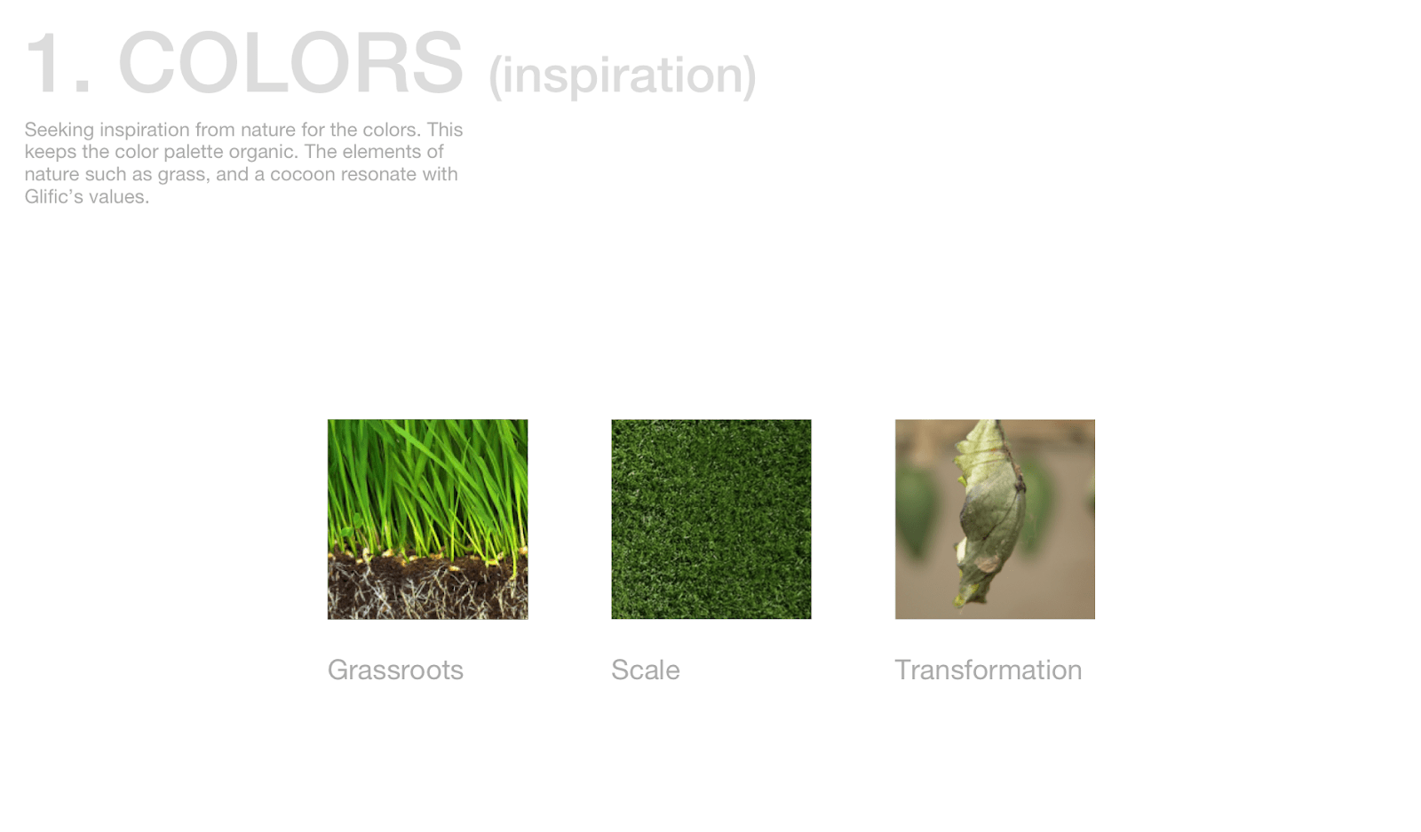
Scale,
Grassroots,
Transformation,
Libre and Open source,
Affordable and intuitive,
Our initial sketches revealed that we wanted to go with the representation of chat and to directly make the two-way aspect really clear.
![]()
We found these three interesting in the beginning and decided in unison with the partner team that the logo should have the full name instead of just ‘G’ to avoid leaving our audience confused about what the G stood for.
As we explored more, and a lightning strike later, we reached our final logo as explained below.
![]()
The keywords helped us to decide the symbol and the color scheme that the logo would be developed on. We wanted the product to be recognized as a communication(messaging) platform without being lost among others. There were many options to select from for the basic logo symbol.
![]()
But this creation process clearly made the choice of symbol really clear.
![]()
(Behind the scenes, we tried many many other variations),
![]()
To fit everything perfectly well together, between the curves of the logo and the typography, we created a custom typeface to make it come together.
![]()
![]()
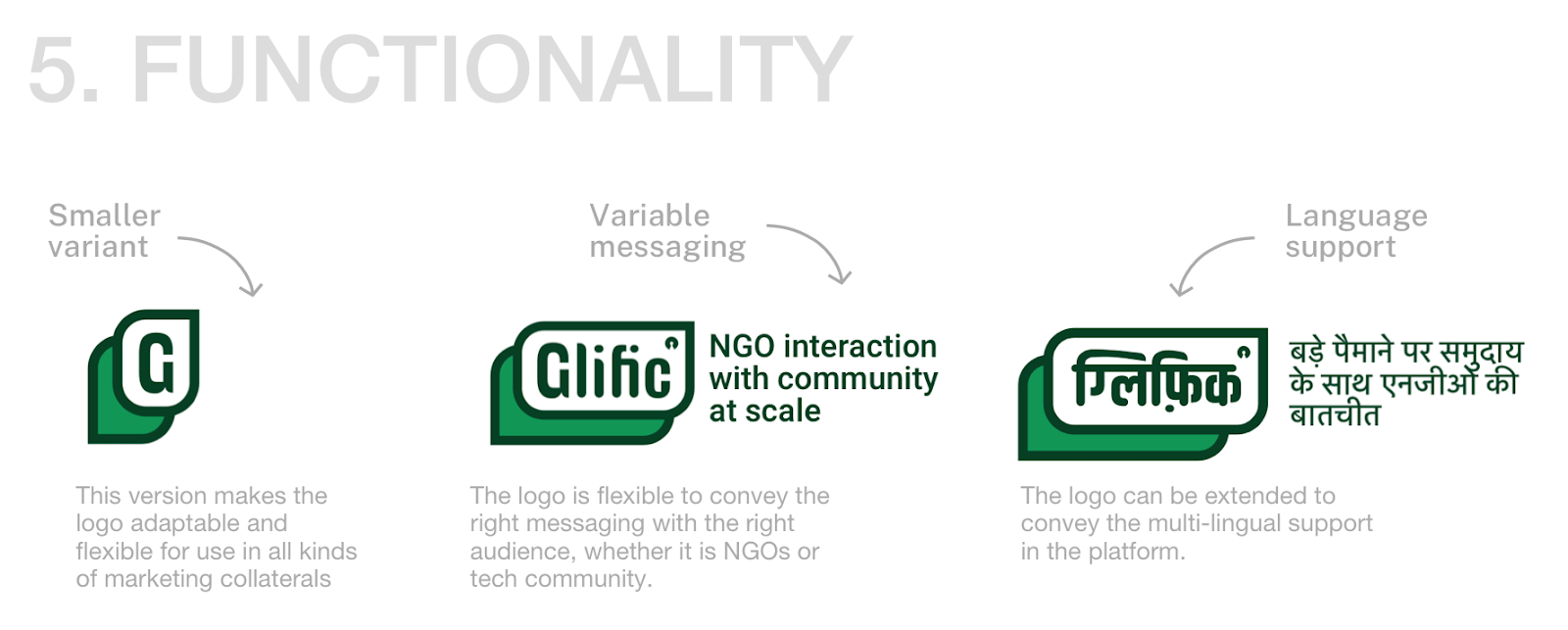
Besides getting it’s striking visual appeal, we wanted to make the logo really strong functionally, so that the logo could stand alone and explain the product to its audience by itself, at least in the beginning and as we progress and people get familiar, the variable messaging can be dropped and a lean version can be used.
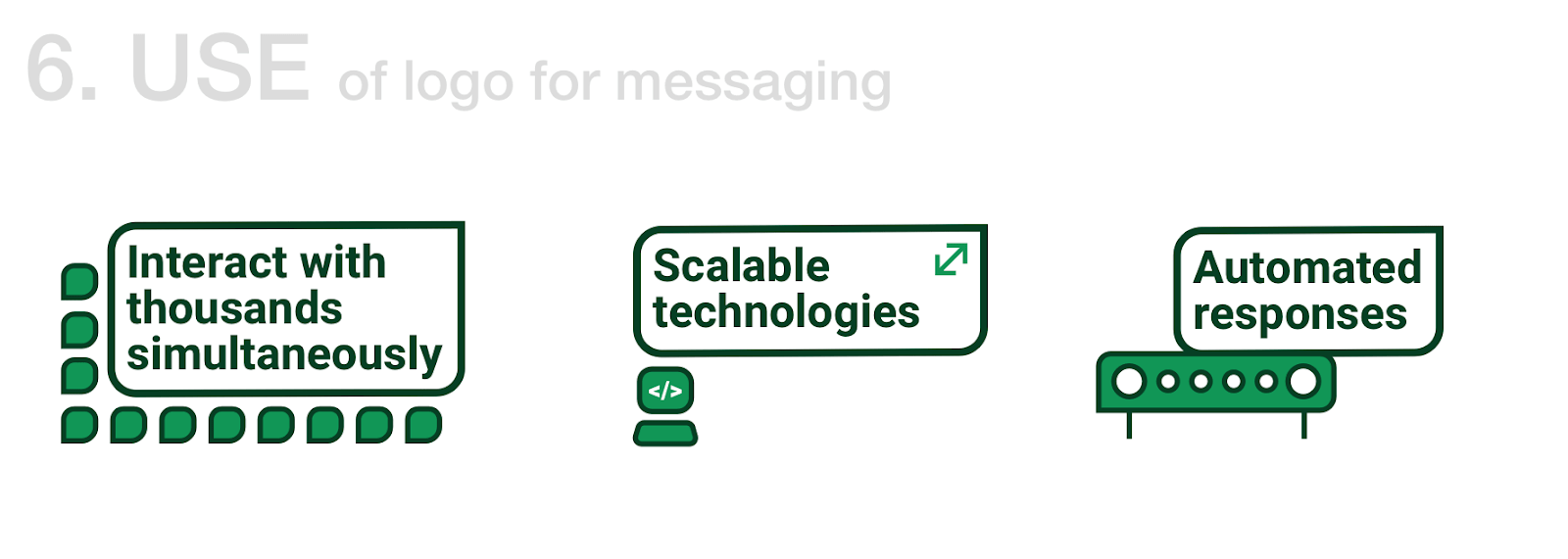
And then moved into building a visual language deeply integrated with the logo. These three messages: Interact with thousands of people simultaneously, Scalable technologies, and Automated responses were really core to the main attractions of the logo and hence we created some catchy imagery which could be used with marketing collaterals.
The visual language extended to more collaterals that we built upfront. It would also lay down the foundation for future designs and set guidelines for scalability.
![]()
![]()
As straining as the process of coming up with a new logo mark out of thin air is, it’s equally fun to then expand the logo’s visual sense to create collaterals and build it for practical use.
![]()
And we arrived at this logo. This got finalised because of its vibrance, it’s minimalistic design, and ability to leave an impression. Once we saw this, we couldn’t unsee it, it was imprinted in our minds and made a mark above any other logo variations.
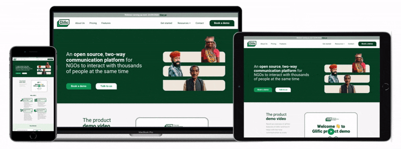
We naturally progressed into implementing all of the brand language into the marketing website for the product. Other than a logo to make a symbolic presence in front of the audience, there was an urgent need to put all the product information at one common place. It was getting tiring for the team to share multiple links/resources to know about the product. And hence we built a repository of information onto a mobile responsive website.
It is fully functional at: https://glific.org/
Built on WordPress, it supports a CMS for any content changes required at any time. Building it with a CMS is also effective since the product is evolving which makes frequent content and image updates almost inevitable.
Design a branding and visual system for a communication platform for the social impact sector.
A vibrant, easy to remember logo that clearly communicates the value of the product.

A world of sentiments and information fit into smallest of symbols. That's the magic of branding.
Abhishek Sharma