A customer-centric approach while visualizing the design helps in understanding how the user would want to experience the platform. This helps in creating a product that aligns with customer’s needs, making it is easy and fast for him to find the exact solutions.
With this in consideration before moving ahead with the design & development cycle it is pivotal to prioritize the requirement phase. With that as a thumb rule, we make it a point to dedicate a chunk of our time to research and analyze requirements while executing any project. The research is carried out based on different user needs.
While working with Diana and Hoell on their pediatric therapy website we focused on the same approach. We had been working with Hoell in healthcare sector from one of our first healthcare projects and were developing his electronic therapy platform when we received another project from him. This healthcare project was related to pediatric therapy for children with special needs. The project was headed by Diana and her organization was among the first users of the electronic therapy platform, we received this project organically as Diana was familiar with our work.

The research and initial requirement phase started by understanding the organization’s scope of work, their target users i.e parents and Diana’s vision of how she wants their digital image to come out. We centered our designing on the parent’s needs, putting ourselves in their shoes, imagining how they would experience the website and which element should be placed where. Focusing on how they would look for a clinic and what are their major concerns.
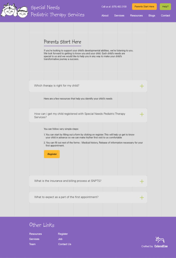
For instance, we have put a button on the website [parents start here] which takes parents through some of the important things they would expect of a pediatric therapy clinic. This gives them an opportunity to see the broader picture and be comfortable about the different aspects.
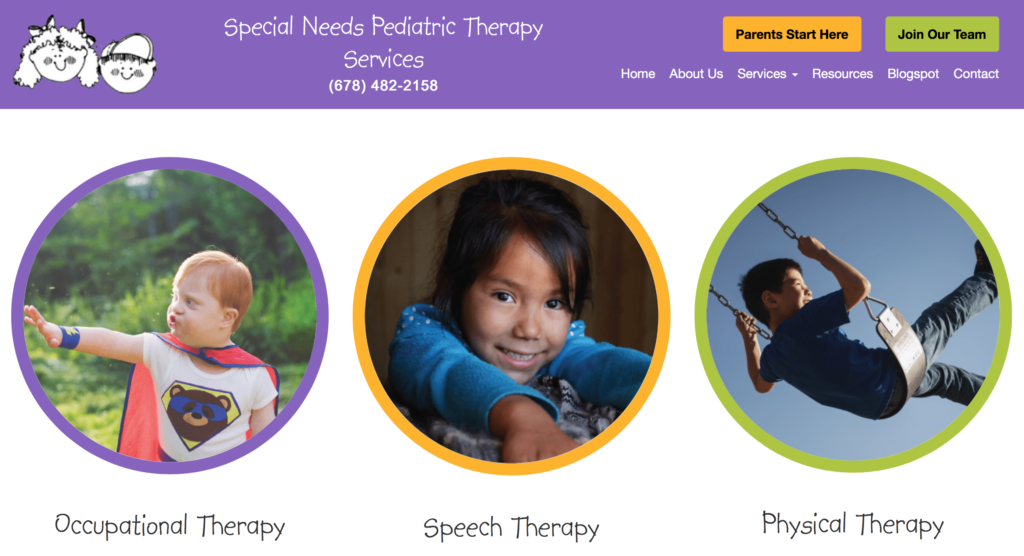
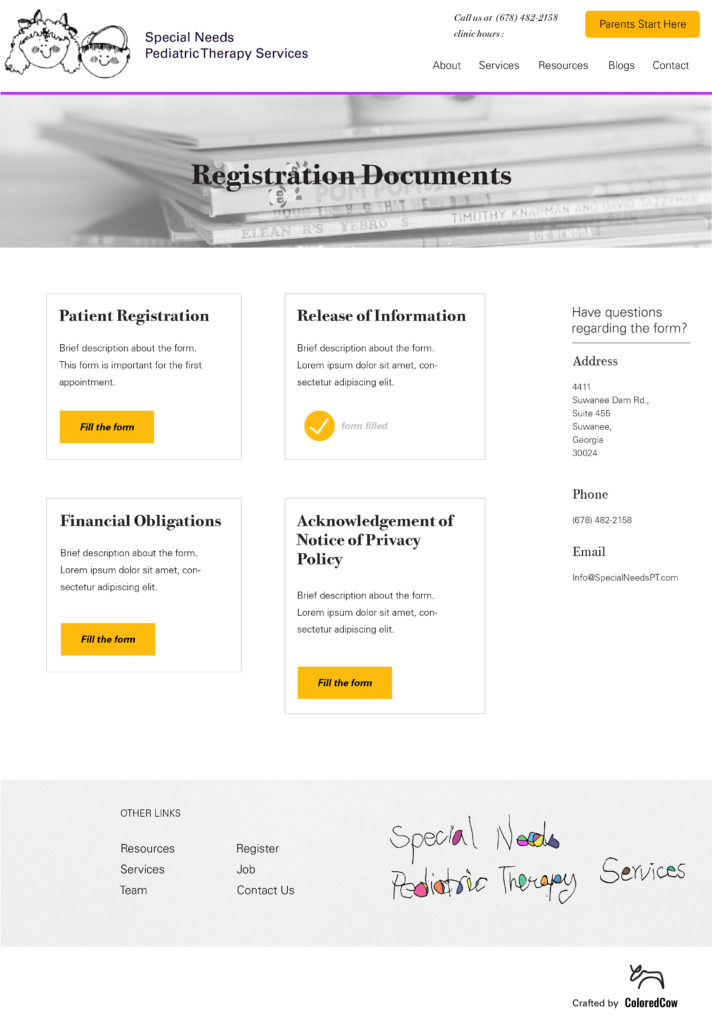
The rest of the website is designed such that it gives the parent a bit more time to explore options for their kids. The registration option is also available so that it is easy for them to connect and register their kids. The design was also developed keeping in mind how a clinic would want to represent themselves, the aspects that they would like to highlight more like their services, team, etc.

Also while executing the requirement phase a lot of stress was laid on documentation. Not just the design but also the approach and the research was recorded. This further helped in the development phase as the developer was able to create a lucid image of what was required.
The requirement and development phases were spaced from client’s end due to some other projects and hence here documentation bridged the gaps. We have seen and have repeatedly verified that creating a clear picture in the requirement phase results in developing stronger end products and this pediatric therapy website has been an example of it.

Designing from both the client and user end by putting ourslves in their shoes and developing a product that is in sync with their needs
Abhishek Sharma