A product may have two interaction points – the interface, used by its customers, who directly use the product and the reporting/analytics, used by admin, who record and understand the behavior of the customers. The product’s success is largely based on the efficiency of both the interaction points. Just as important it is to design the interface of an application for a good customer experience and engagement, the reporting/analytics part of the application should be designed optimally as well.
One of our clients was using a primitive way of reporting customer data, which recorded in numbers, where the customers were in the system. The system was divided into stages and the customer interaction with the system was studied according to their demography and other categorizations such as how they entered the system and whether they were moved between stages without holdups. This was a crucial information for our client from customer perspective and they had simply put the numbers in excel-like cells of rows and columns. This would have reduced the scope of data analytics along with making it difficult to go through the bulk of numbers.
We wanted our client to be able to leverage the data and make it useful for themselves which meant that we had to propose an entirely new design.
The constraints were, 1) to have all the data sets in full view so that they could be compared against each other, 2) the ability to see how each data set was affected by the other. Example: if there were X women in the system then how many of X were in the first stage, how many men in the age group 40-50 entered the system that day. If our clients were swiftly able to see all that, they could easily improve their services.
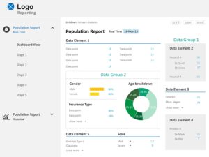
We began by understanding what each data element meant to the system and by plotting their order of importance. By putting the most important data on the top we made sure the admin/data scientist always has access to it and relies on his instinct rather than mental cognition to remember each time which that most important data is.
Next we looked into the functionality of the report. To make it functional we tested the most natural way in which the report would be read. We brought in our developer who knew the system inside out to help us with this. We discovered layers in the report that our developer crossed to get to the final data. We plotted these on three axes. The layers were: Stages>Data>Drilldown.
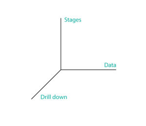 We made the stages appear in a panel on the left (refer to the image below) so that the data could be changed according to a stage in just one click. The Data was structured next to it such that it doesn’t change for any stage. This would allow the admin to remember where to find the desired data element in each page. And for the drilldown, we made each data point clickable; this way they could see in one screen how rest of the data changed according to one data point by simply clicking on that data point.
A few more functionality considerations-
We grouped the common data elements together because they were more related to each other and set them slightly apart from other data elements. This helped us in chunking the data to make it easier to understand.
We realized that there was no way to recover from drilling down into the data. We added a breadcrumb-like trail so the user knows the route they took to arrive at the data, at all times.

For the admin to save, print or mail the report, we added small buttons in light colors so that it doesn’t draw too much attention and at the same time, the user doesn’t have to work too much to achieve this utility.
Then it was the time to make it aesthetically appealing. Setting a rhythm and hierarchy through font sizes helped us get a good readability. We set the data points which occupied most of the space to 14 pts, data element to about 1.3 times and the title of the page to 1.8 times of this. We were particular about making it easy to glance through since there were a lot of numbers on one screen.
Calibri (font) seemed to work well for our reporting screen.
For contrast we used blues and greys, occasionally switching to other colors to make it a bit more interesting.
We used icons sparingly because too many could have added to the cognitive load. In other cases icons may work well. It is always better to use them with some text unless the context and the meaning of the icon is absolutely clear.
The design is successful when it has captured the purpose of whatever is being created and it makes the user feel smart for being able to use your design instinctively and achieve the task they aimed.