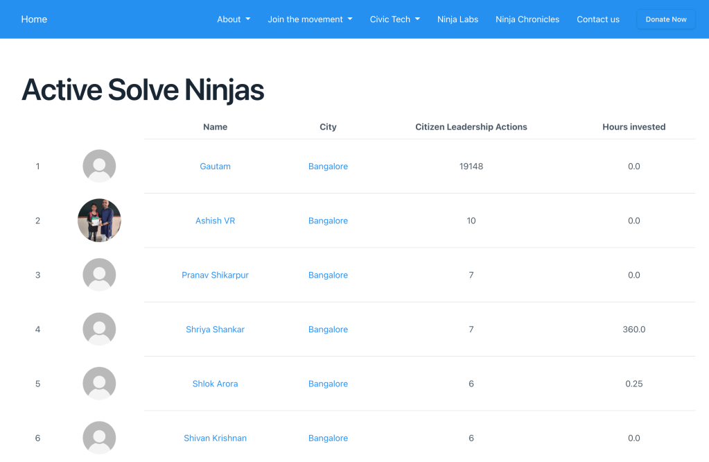
For the past few months, we have been working with Reap Benefit to visualize citizen engagement of their chatbot in a mapping dashboard created in R/shiny. Read more about their journey with Glific and our journey in creating the dashboard here.
Initially, we went with the combination of Glific, BigQuery, and R/shiny.
Glific: To report any local issue, a beneficiary sends details of the issue through WhatsApp messages to the chatbot.
BigQuery: all the data collected in Glific is then synced to Bigquery where data can be cleaned and all details of an issue can be clubbed together as a single entry
R/shiny: Cleaned data can be then queried and populated on the map to visualize the information shared on the dashboard
Next, we started integrating Frappe to replace Bigquery so that it can serve as a single place for storing all information of an organization. In ReapBenefit’s case, it helps as all the information gathered through WhatsApp can be stored across different tables.
In addition to being a central repository for all data, some other cool features of Frappe which caught our eyes

Thus visualizing citizen engagement of a chatbot becomes a two-step process
In a recent Tech4dev sprint along with Tejas and Gautam from Reap Benefit, we met Ankit who is currently working with Reap Benefit, as part of the fractional CXO initiative of Tech4Dev. We all sat together and discussed the work done so far, how we can improve in the future, planned next milestones, and how this feature can be generalized for other NGOs.
