December 23, 2023
We recently found out that our client has to pay so much for the cost of using the GCP. So we decided to do a GCP audit to find out from where most of the costs are coming out. After the audit, we found out that we are spending thousands of dollars every month just on the BigQuery. The BigQuery had a lot of Scheduled queries running which were necessary to update the data sources for analytics purposes. Then we decided to create a monitoring dashboard to track the cost of each query running on BigQuery. So we came up with the monitoring dashboard created on Looker Studio (previously Data Studio). We monitored the queries and optimized all the queries which were costing us the most. After the optimization, we figured out that the cost of Bigquery was reduced by 50%-60%.
If you are also using BigQuery for storing your data or creating reports or anything, you might also have wondered how much I am spending whenever a query runs on BigQuery. So let’s get started with creating a monitoring dashboard on Google Looker Studio.
Storing BigQuery logs to the BigQuery dataset
So first of all we need to get all the logs generated by BigQuery to a dataset, so let’s start with creating a dataset.
- Go to BigQuery and you will find the Explorer pane
- click on the menu dot beside your project name
- Select create dataset
- Enter a name for the dataset in the dataset ID
- Here we have named it `sink_logs`
- Select location type as Region and select your region
- Click on Create dataset
Creating a Sink
Now we are ready with our dataset where we will get all the logs generated in the BigQuery, but how??? So we need to create a sink for this. A “sink” typically refers to a component or mechanism used to route, collect, and manage logs or metrics from various services and resources within the GCP environment.
To create a sink:
- In the Cloud Console, go to “Logging” > “Logs Router.”
- Click on “Create Sink.”
- Provide a name for the sink and a description.
- In the “Sink Service” dropdown, choose “BigQuery dataset.”
- Select the “Sink Destination” as your desired BigQuery dataset where you want to export the logs.
- Check mark the Use Partitioned Table checkbox.
- Optionally, you can set a filter to specify which logs should be exported based on certain criteria. For that under the Choose logs to include in the sink, add this line:
| resource.type=”bigquery_project” |
- Click “Create Sink” to save the configuration
Now we will start getting the logs into a partitioned table within the dataset we created. All set!!
Creating a data source using a custom query
Now we are ready to create a chart in the Data Studio/Looker Studio. So first we need to create a data source for it.
- Go to https://lookerstudio.google.com/navigation/datasources
- click on create and select data source
- Select BigQuery as a connector
- Select CUSTOM QUERY and use the following query.
SELECT
  protopayload_auditlog.authenticationInfo.principalEmail AS user,
  CAST(7.5 * (CAST(JSON_EXTRACT_SCALAR(protopayload_auditlog.metadataJson, '$.jobChange.job.jobStats.queryStats.totalProcessedBytes') AS INT64) / POWER(2, 40)) AS NUMERIC) as queryCostInUSD,
  CAST(JSON_EXTRACT_SCALAR(protopayload_auditlog.metadataJson, '$.jobChange.job.jobStats.queryStats.totalProcessedBytes') AS INT64) as totalProcessedBytes,
  CAST(JSON_EXTRACT_SCALAR(protopayload_auditlog.metadataJson, '$.jobChange.job.jobStats.queryStats.totalBilledBytes') AS INT64) as totalBilledBytes,
  CAST(CAST(JSON_EXTRACT_SCALAR(protopayload_auditlog.metadataJson, '$.jobChange.job.jobStats.queryStats.totalProcessedBytes') AS INT64) / 1000000000000 AS NUMERIC) as tb,
  JSON_EXTRACT_SCALAR(protopayload_auditlog.metadataJson, '$.jobChange.job.jobConfig.queryConfig.query') as query,
  REGEXP_EXTRACT(JSON_EXTRACT_SCALAR(protopayload_auditlog.metadataJson, '$.jobChange.job.jobConfig.queryConfig.query'), r'-- tag: (.*?) tag ends/') as report
FROM
  <Your GCP Project id>.sink_logs.cloudaudit_googleapis_com_data_access
WHERE
  JSON_EXTRACT_SCALAR(protopayload_auditlog.metadataJson, '$.jobChange.job.jobStats.queryStats.totalProcessedBytes') IS NOT NULL
  AND DATE(timestamp) >= PARSE_DATE('%Y%m%d', @DS_START_DATE)
  AND DATE(timestamp) <= PARSE_DATE('%Y%m%d', @DS_END_DATE)
Creating a chart on Looker Studio
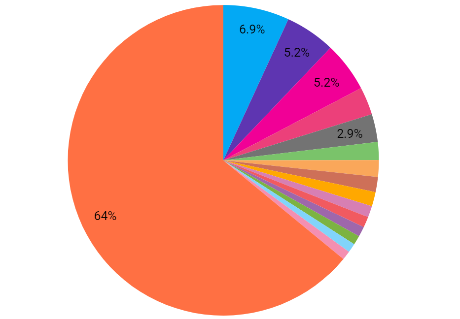
To show the cost per query
Now the data source is ready to use. You can rename it from the data source page. Now go to the data studio page, click on Insert and select Chart.
- You can use any type of chart of your choice, we are using a pie chart here
- For the chart’s data, choose the “Data Source” that we have just set up.
- In the “Dimension” field, choose the field that represents the “query”
- In the “Metric” field, choose the calculated field ie. queryCostInUSD.
The chart will show the cost taken by each query running on the BigQuery and will look like this:
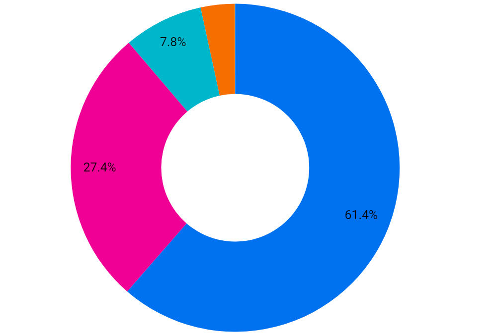
To show the cost per user
You can also create a chart to show the cost incurred by each user if there a multiple users using the same project. For that, you will need to follow the steps same as above, but just in the dimension field, select “user”. This chart will now show the cost for each user. We are using a doughnut chart to represent this:
Adding a table to the dashboard
Now we can also insert a table to get the list of queries and the cost related to that.
- Click on “Add a chart” and choose the “Table” or “Table with heatmap” chart type.
- Again, choose the “Data Source” we have set up for storing the logs for the chart’s data.
- In the “Dimension” field, choose the field that represents the query or query ID.
- In the “Metric” field, add additional metrics that we want to display in the table, such as the bytes processed query cost or any other relevant information.
So here is a final BigQuery dashboard where you can get the details of all the queries running on the BigQuery and the cost related to that query.
Business Impact of Monitoring Dashboard
At the end of June, we were informed by the client that the cost of GCP was double as it usually came earlier. So we conducted a GCP audit where we found out that BigQuery was taking most of the cost. So we proposed to create this monitoring dashboard for BigQuery. In July, we created this dashboard and after the successful implementation of the dashboard, we found our top 4 queries which were costing us the most. We started optimizing these queries and at the end of July month, the cost of GCP was significantly reduced by 25-30% of the previous month’s cost. After this success, we continued to optimize further queries. At the end of August, the cost was reduced by 50-60% of the initial billing.
After the optimization of queries, we were also able to know which users are taking how much cost. So as there were a few different teams that were working with the BigQuery, we also informed them to optimize the queries they were working on. This helped our client to get a complete insight into the queries and users and helped them save a lot of expenses that were recurring for every month.
Outcomes of the Dashboard
- Cost Reduction and Savings: The most immediate and measurable outcome is the reduction in costs. By actively monitoring and optimizing BigQuery queries, businesses can realize substantial savings, freeing up financial resources for other strategic initiatives. We saw a significant 50%-60% reduction in BigQuery costs after implementing optimizations.
- Positive Impact on ROI: Reducing unnecessary expenses, coupled with improved resource efficiency and performance, directly contributes to an enhanced Return on Investment (ROI) for GCP usage. The implementation of the monitoring dashboard becomes a strategic investment that pays off in terms of cost savings and improved operational outcomes.
- Enhanced Resource Efficiency: Resource optimization is a direct outcome of the monitoring process. Identifying and rectifying resource-intensive queries leads to more efficient utilization of computing resources. This optimization not only reduces costs but also ensures that resources are available for critical business functions.
Conclusion
When you are using BigQuery and are unaware of how much cost each query running on it will take, then you will be just surprised by your monthly bills. Having a cost monitoring dashboard is a great tool to make timely decisions on optimising queries, and removing unnecessary usage of resources. The results speak volumes: we achieved a 60% reduction in our monthly bills on BigQuery. The ability to identify, analyze, and optimize individual queries has not only saved significant financial resources but has also streamlined operations, paving the way for a more collaborative and agile work environment. The outcomes extend beyond mere cost savings. The real-time decision support provided by the monitoring dashboard empowers stakeholders to address cost-related issues promptly. Improved resource efficiency, data processing performance, and scalability planning contribute to a positive effect throughout the organization.
As we conclude this journey, it’s clear that a well-designed BigQuery cost monitoring dashboard is not just a tool for financial oversight; it positions organizations to make informed, data-driven decisions, optimize resource utilization, and achieve a higher return on their cloud infrastructure investments.
Stay Tuned with us for the complete case study on cost audit and optimization with the help of a monitoring system.