Glific is a latest entry to the Tech4Good landscape of digital products for the social impact sector, being built by Chintu Gudiya Foundation. Glific empowers communication between NGOs and their beneficiaries, thus facilitating some of the most crucial, life-changing conversations in our society. Our product design goal was to translate the vision through easy to use, and adaptable application.

Understanding the communication needs of NGOs. Highlighting the gaps and opportunities
Glific is the only libre, open source two-way communication platform built on WhatsApp business API. We had to begin with getting really familiar with how NGOs communicate today, what are their processes and experiences so far.
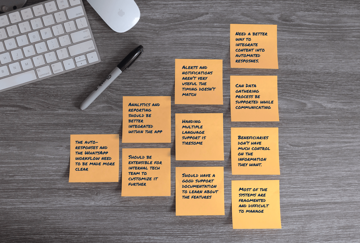
Spending a month interacting with many NGOs(more about product research here) we discovered various insights. We met with the NGOs who had used some system or the other for their communications. Their challenges and aspirations helped us decide the direction for our product. We collected all of their challenges/gaps so that we could design for those as opportunities in our application.
Getting a product from scratch off the ground. Starting with user journey mapping.
The initial stages of creating a product prototype involves demystifying the various user experiences and the journey they will take. We approached the design by creating an ideal real-life journey of the user from the start to achieving their goal, before we started thinking in terms of screens and UI elements. This journey map allowed us to constantly think of their experience. It also helped us put ourselves into our users’ shoes throughout the UI/UX design process.
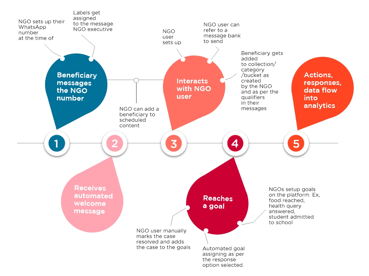
User Journey Mapping
Aligning all the stakeholders on the solution with quick prototypes
We began the design process with documenting requirements to align all the stakeholders towards the single goal. However, for building the application words are too abstract. And after the requirements we needed something more concrete to lay down the foundation, which is why we started giving our application further structure with high-fidelity wireframes. This not just helped us to look at the solution from different perspectives, it also ironed out the process between front-end, back-end development and design.
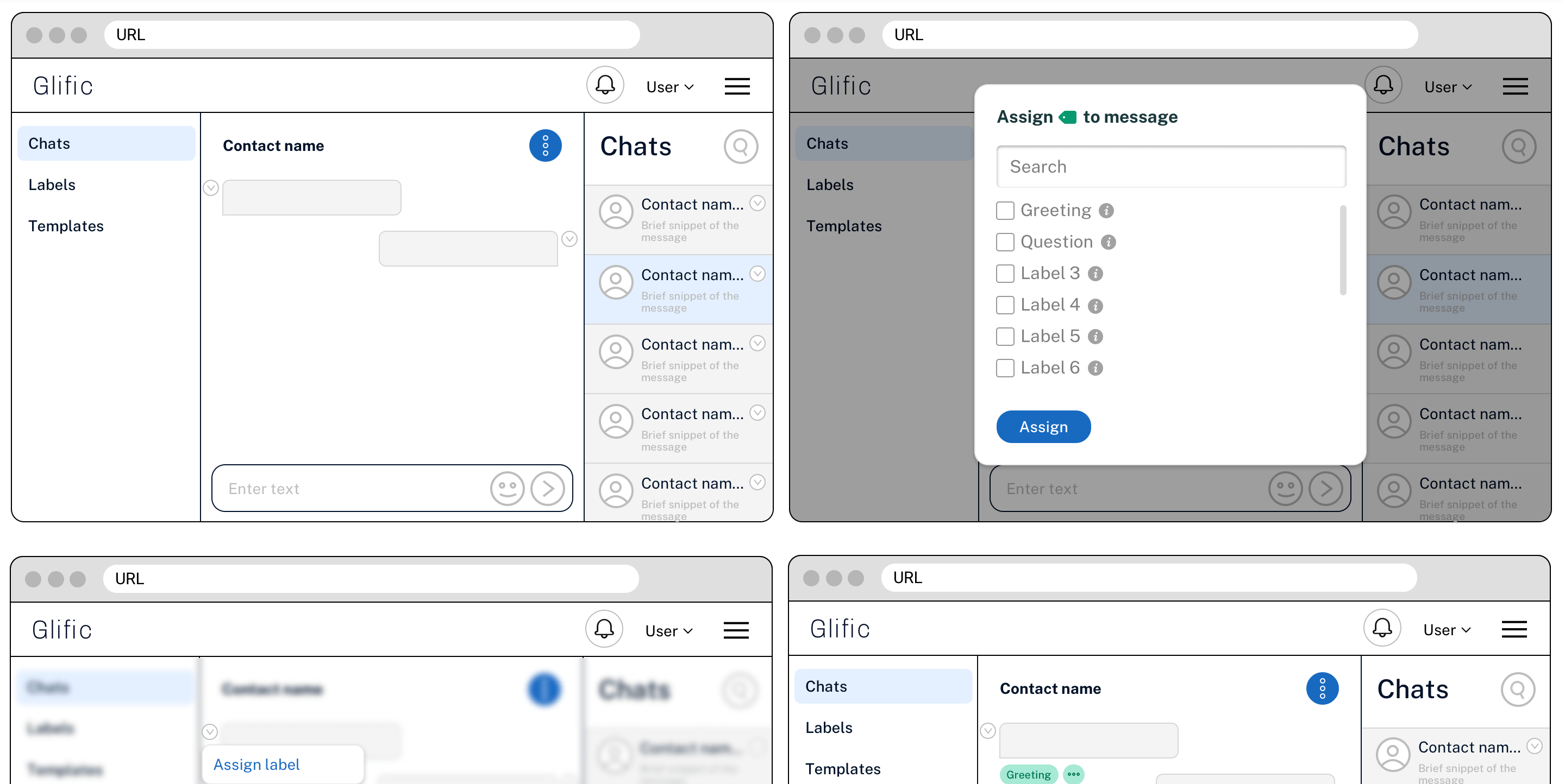
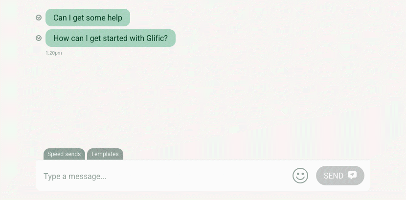
Replicating user’s experience before building it. Clickable prototypes and mocked up user interactions was the way.
The wireframes had cleared out a lot of the early stage abstractions of the product. How the various features will sit together on the screen and will our users understand it the way we’re building it. To further bridge the gap between user experience and our application design, we set up clickable prototypes. This left nothing to imagination for us and the teams. We could plan the user journey before building those functionalities. And make course corrections without investing a ton of development time and effort. These are especially helpful during the early stages of the product development because the canvas is totally clean and experiments are required to get things right.
Facilitating behaviour change from interacting with a couple of beneficiaries to a couple thousand.
Glific doesn’t just digitise the conversations, but also empowers its users to do it over a large scale – interacting with thousands of beneficiaries simultaneously. We realise interacting with a couple of people is very different from interacting with a couple thousand. This meant that the challenge for our design team was to make basic conversation functionalities intuitive, and at the same time make it easy to use advanced functionalities that enable them to tap into scale.
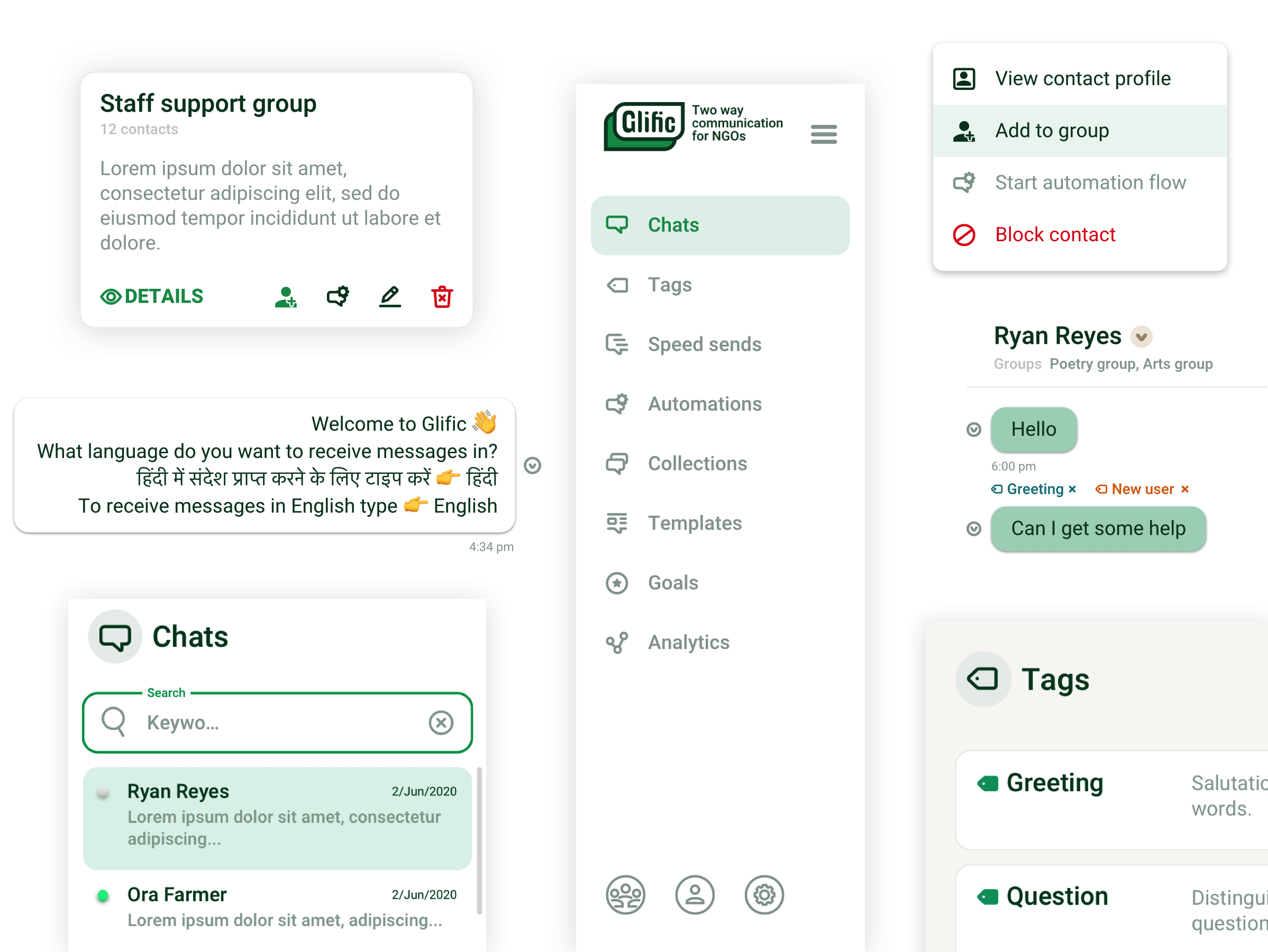
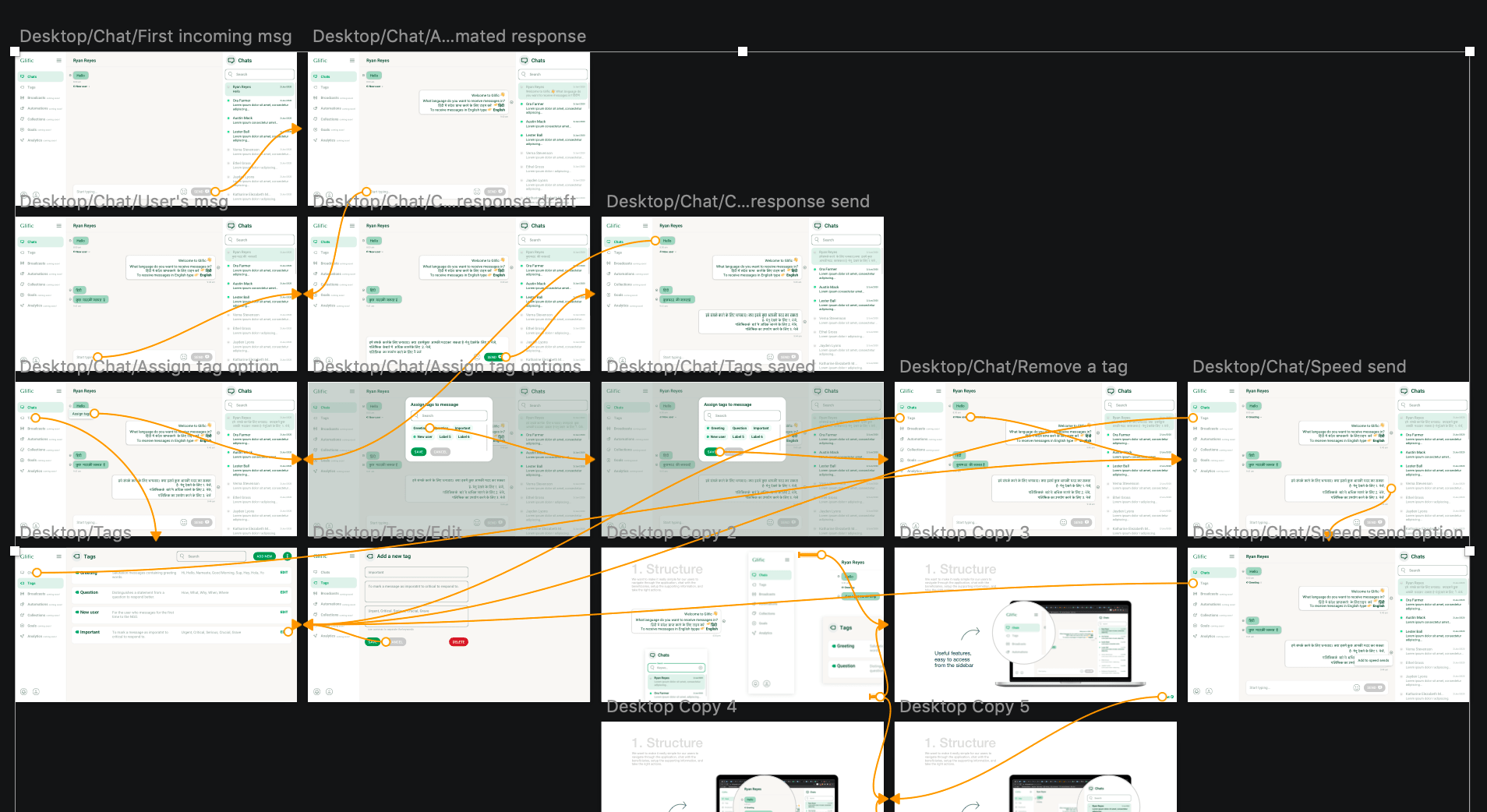
UI Elements that make up the application
Enhancing application discovery and learning process
Other than making the application intuitive, creating supporting resources for users is essential to drawing them in and enhancing the discoverability of the application. The more users are empowered about the application, the better chances are that they will convert faster and start using the application. This was especially doable for us since it’s an open source application and there was no loss of market edge. However, demo videos(watch here) can greatly strengthen the user’s understanding of the application.

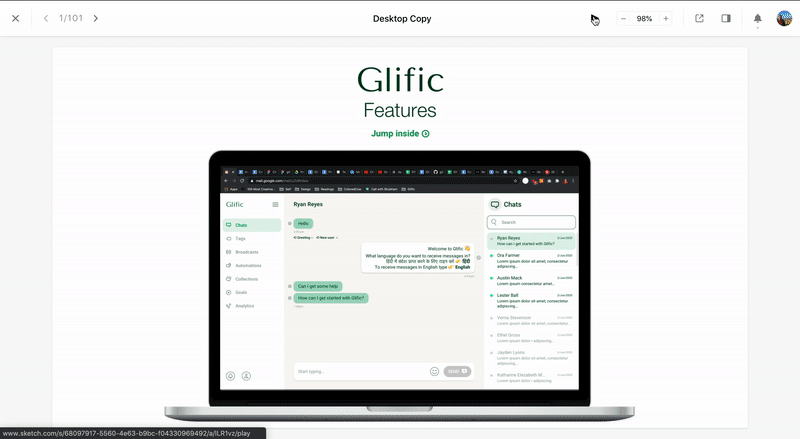
Getting a product from idea and vision to a tangible, intuitive application
An application that welcomes its users with a user friendly appeal and makes them communicate with thousands of people at a click
SketchApp
Figma
Adobe Illustrator
Adobe After Effects

Our product design goal was to translate the vision into a meaningful, easy to use, and adaptable application.
Abhishek Sharma